Info Type
View Option
Sort by Category
Back
Notification
LTSS webinar tomorrow, September 25 – Fall-Free Fridays: Expanding Education to Prevent Injuries
- [Registrant]Centers for Medicare & Medicaid Services (CMS)
- [Language]日本語
- [Location]Baltimore, MD
- Posted : 2024/09/24
- Published : 2024/09/24
- Changed : 2024/09/24
- Total View : 45 persons
- Find local business with Town Guide
-
- Routers Wi-Fi, el precio más bajo de Haw...

-
Disfruta de Hawái 100 veces más ! ! Los routers Wi-Fi se están convirtiendo en una necesidad para los viajes internacionales, y con Vision Mobile, puedes alquilar uno el mismo día en Hawái ! ! Conex...
+1 (808) 922-1010Vision Mobile Hawaii Inc.
-
- El restaurante de sushi Sushi Kai ofrece...

-
Restaurante de sushi Sushi Kai Los cursos omakase son abundantes y saciantes, con pescado fresco a precios asequibles. Ofrecemos un curso omakase de una hora por 85 $ por persona, que incluye tres a...
+1 (914) 396-7705Sushi Kai
-
- Cultivo de hierbas y flores comestibles ...
-
Inaugurado en abril de 2023, el puesto de agricultores naeme es un punto de venta directa y cafetería, que sirve un menú con hierbas y flores comestibles producidas sin pesticidas. El menú es diferent...
+81-50-1551-0964苗目
-
- Fideos caseros hechos en la tienda cada ...

-
El propietario japonés tiene 30 años de experiencia y el restaurante tiene un ambiente hogareño con muchos clientes locales que buscan la hospitalidad japonesa y la atención al detalle. Pruebe los pe...
+1 (310) 448-8886VENICE RAMEN
-
- El rancho Kualoa ・ es un centro de activ...

-
Kualoa ・ Ranch es un centro de actividades de naturaleza salvaje ・situado en el noreste de Hawai ・ Oahu. Se ofrecen unas 10 actividades y deportes marinos diferentes como excursiones opcionales, entre...
+1 (808) 237-7321クアロア・ランチ
-
- Con el lema "Más barato ・ Más rápido ・ M...

-
Con el lema "Más barato ・ Más rápido ・ Más bonito", aspiramos a ser una tienda de limpieza en la que confíen nuestros clientes.
+81-439-55-0066クリーニングミツミネ・ホワイト急便ミツミネ
-
- Japan ・ Society Language Centre de Nueva...

-
Japan ・ Society Language Centre Creado en 1972, el Japan ・ Society Language Centre es el mayor instituto de lengua japonesa de Nueva York y el mayor de Norteamérica. El centro ofrece una gran varieda...
+1 (212) 715-1269Japan Society Language Center
-
- Para la ropa de cama, visite Todaya Bedd...
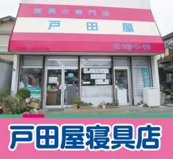
-
Para la ropa de cama, visite Todaya Bedding Store con un asesor del entorno del sueño ! Sólo tiene que cambiar su ropa de cama y dormirá de otra manera ! Ya están disponibles las consultas gratuitas s...
+81-439-54-1218戸田屋寝具店
-
- Kamogawa SEASIDE BASE" tiene una gran ub...

-
Cuando vengas a Kamogawa, por qué no pasar un rato chill en la mejor ubicación ?Los asientos de la terraza ofrecen un espacio maravilloso donde puedes tener el mar de Kamogawa para ti solo. Crea recue...
+81-4-7096-7676Kamogawa BREWERY
-
- Si quiere comer pescado local, venga a n...

-
Banquetes disponibles ! Tateyama ・ Disfrute del pescado local más fresco y fino de las aguas que rodean la zona desde Minami-Boso hasta Sotobo ! Disponemos de una amplia selección de platos, así como...
+81-470-23-9022美味い家 若鈴
-
- Cafetería muy popular con almuerzos deli...

-
Popular cafetería con almuerzos delicatessen elaborados con verduras frescas de Hawái ! Deliciosos platos recién preparados a diario con una gran variedad de verduras hawaianas. Vegano Batidos vari...
+1 (808) 737-2840KAIMANA FARM CAFE
-
- Nail&Tienda especializada en pestañas El...

-
VIANGE SPA Nail&Tienda especializada en pestañas por personal japonés ABIERTO Las uñas de gel se hacen en Japón, por lo que son seguros y suaves en sus uñas. Manicuristas experimentadas le propondrá...
+1 (408) 320-4940VIANGE SPA NAIL&EYELASH
-
- Especialistas en pago con tarjeta de cré...

-
Su empresa también puede ser inteligente Smart International cumple 25 años este año. Somos la única empresa de EE.UU. que ofrece servicios comerciales en japonés y llevamos desde 1995 ayudando a em...
+1 (800) 500-2899Smart International Service
-
- La Asociación Japonesa de Houston es par...

-
Organización sin ánimo de lucro formada exclusivamente por voluntarios japoneses, estadounidenses de origen japonés y otras personas interesadas en Japón que viven en el área metropolitana de Houston,...
グレーターヒューストン日本人会
-
- Venga a jugar al golf con nosotros en Ba...
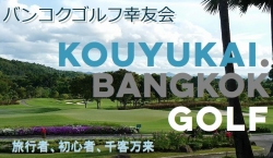
-
El Bangkok Koyukai busca nuevos miembros. Principiantes. Hombres y mujeres, jóvenes y mayores. Viajeros. Todos primerizos. No dude en ponerse en contacto con nosotros.
(086) 797-4121バンコク幸友会
Centers for Medicare & Medicaid Services
Long-Term Services and Supports
WEBINAR
Elderly man with grandchildren
Fall-Free Fridays: Expanding Education to Prevent Injuries
*Wednesday, September 25*
This webinar will highlight Fall-Free Fridays, an award-winning social media livestream to educate the community about falls prevention. The initiative is the result of a partnership between the Area Agency on Aging District 7 (AAA7) in Ohio and the occupational therapy program at Shawnee State University.
Objectives:
* Explain how the partnership between AAA7 and Shawnee State University came about
* Discuss the role of each partner in developing, implementing, and sustaining the Fall-Free Fridays initiative
* Provide an overview of efforts to make sure the livestream reaches a wide audience
* Describe how Fall-Free Fridays complements AAA7’s other programs to reduce the fear of falling and help elders stay active
Register [ https://kauffmaninc.zoom.us/webinar/register/WN_nrQaBOLcThWTH9QJEMZqnw#/registration ]
Please note your
location's call-in time:
8 a.m. Hawaii
10 a.m. Alaska
11 a.m. Pacific
11 a.m. Arizona
12 p.m. Mountain
1 p.m. Central
2 p.m. Eastern
Have questions for our presenter? Let us know before the webinar by emailing ltssinfo@kauffmaninc.com.
Register now [ https://kauffmaninc.zoom.us/webinar/register/WN_nrQaBOLcThWTH9QJEMZqnw#/registration ].
Presenter
Jenni Lewis
*Jenni Lewis*
Director of Community Outreach
Area Agency on Aging District 7, Inc.
Watch past webinars [ https://www.cms.gov/Outreach-and-Education/American-Indian-Alaska-Native/AIAN/LTSS-TA-Center/LTSS-Webinars.html ] on the Centers for Medicare & Medicaid Services website.
Follow us on X [ https://twitter.com/cmsgov ] View us on X [ https://twitter.com/cmsgov ] View us on YouTube [ https://www.youtube.com/user/CMSHHSgov ] View us on YouTube [ https://www.youtube.com/user/CMSHHSgov ]
*LTSS Training and Technical Assistance Center*
Visit the online Center [ https://www.cms.gov/Outreach-and-Education/American-Indian-Alaska-Native/AIAN/LTSS-TA-Center ] for information, trainings, videos, program models, best practices, a resource library, and a step-by-step planning roadmap.
*LTSS Partners*
Centers for Medicare & Medicaid Services [ http://cms.gov/ ] | Indian Health Service [ http://www.ihs.gov/ ] | Administration for Community Living [ http://www.acl.gov/ ]
________________________________________________________________________
You're getting this message because you subscribed to get email updates from the Centers for Medicare & Medicaid Services (CMS) [ http://www.cms.gov/ ].
Update your subscriptions, modify your password or email address, or stop subscriptions at any time on your Subscriber Preferences Page [ https://public.govdelivery.com/accounts/USCMS/subscriber/edit?preferences=true#tab1 ]. You will need to use your email address to log in. If you have questions or problems with the subscription service, please contact subscriberhelp.govdelivery.com [ https://subscriberhelp.govdelivery.com/ ].
This service is provided to you at no charge by Centers for Medicare & Medicaid Services (CMS) [ http://www.cms.gov ].
________________________________________________________________________
This email was sent to mshinji3056@gmail.com using GovDelivery Communications Cloud 7500 Security Boulevard · Baltimore MD 21244
body .abe-column-block { min-height: 5px; } table.gd_combo_table img {margin-left:10px; margin-right:10px;} table.gd_combo_table div.govd_image_display img, table.gd_combo_table td.gd_combo_image_cell img {margin-left:0px; margin-right:0px;} table.govd_hr {min-width: 100%;}